Data Visualization Team Project
During this team project for INEG 21003 we used Microsoft Excel to explore how several factors relate to performance and behavior in a controlled cognitive task. Our dataset included measures such as caffeine concentration hours of sleep environmental noise level reaction time focus scores across days of the trial and time since last meal. We created four main visualizations a scatter plot a histogram a time series plot and a scatter plot with a behavioral predictor to answer specific questions about these relationships and to practice cleaning formatting and graphing data in Excel.
Caffeine Concentration versus Hours of Sleep
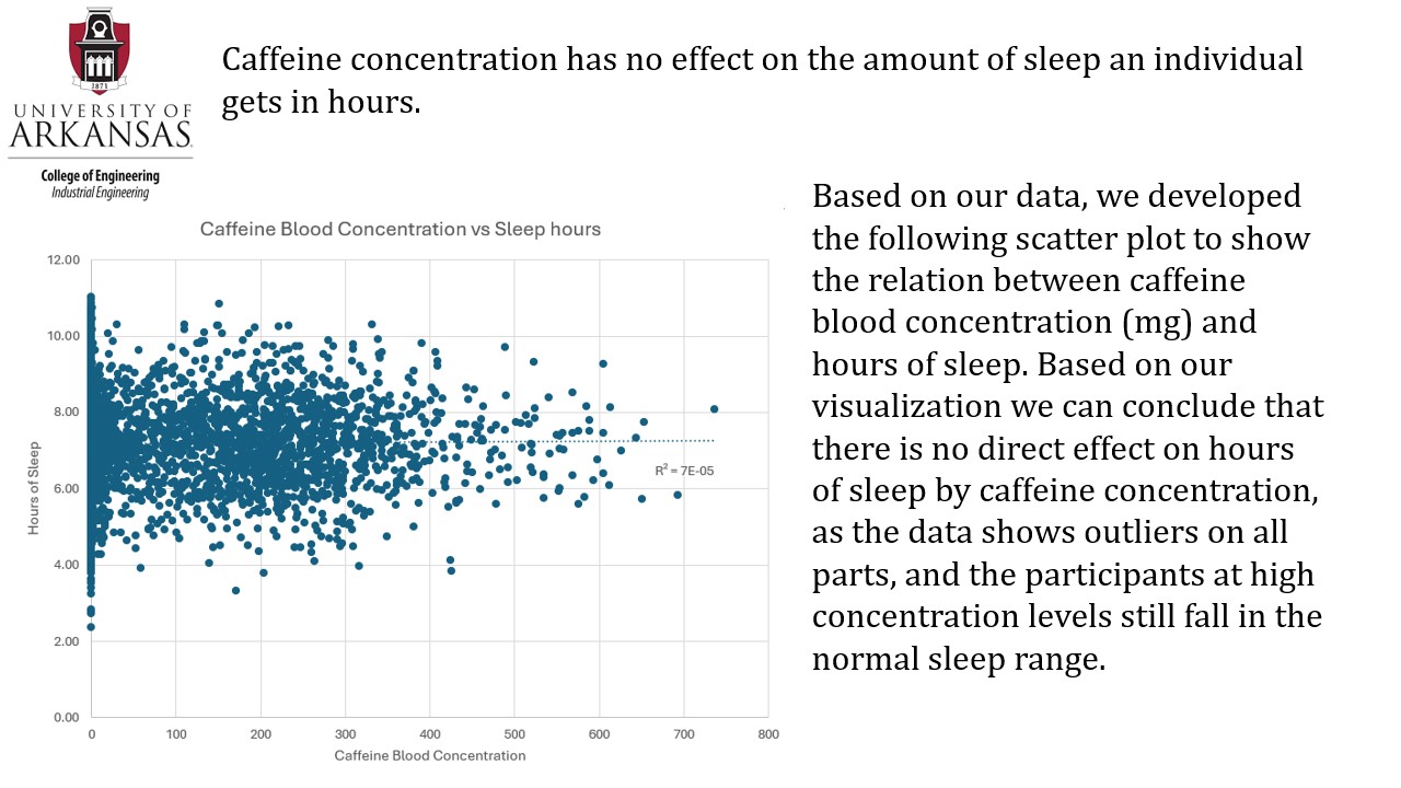
Question. Does caffeine blood concentration affect how many hours participants sleep
Why this question is interesting. Caffeine and sleep are everyday issues for students and working professionals. People often assume that more caffeine automatically means less sleep so it is natural to ask whether the data actually support that belief.
What the visualization shows.
The scatter plot compares caffeine concentration in the bloodstream with hours of sleep. The points are widely spread and do not form a clear linear or curved pattern. High caffeine levels appear with both long and short sleep durations and low caffeine levels show the same mixed behavior. This pattern indicates that in this study sleep variability is driven more by individual differences and day to day fluctuations than by the caffeine levels measured at the time of testing. Caffeine concentration alone does not reliably predict how long participants slept.
Environmental Noise versus Reaction Time
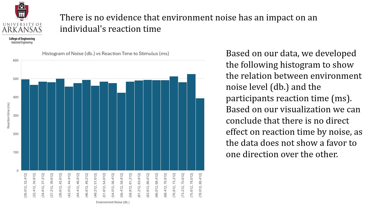
Question. Does environmental noise level influence participants reaction time
Why this question is interesting. Many work and study environments are noisy and there is a common belief that noise slows people down. If noise substantially affected reaction time it would have implications for how workplaces and study spaces are designed.
What the visualization shows.
The histogram summarizes the distribution of reaction times under the noise conditions used in the trial. Instead of shifting into slower reaction times at higher noise levels the distribution remains centered around a similar range with the kind of spread expected in repeated cognitive performance tasks. This suggests that within the noise levels tested participants were able to maintain reaction speed likely because task familiarity and attentional control outweighed any distracting effect of the background noise.
Participants Focus Over Days of the Trial Time Series
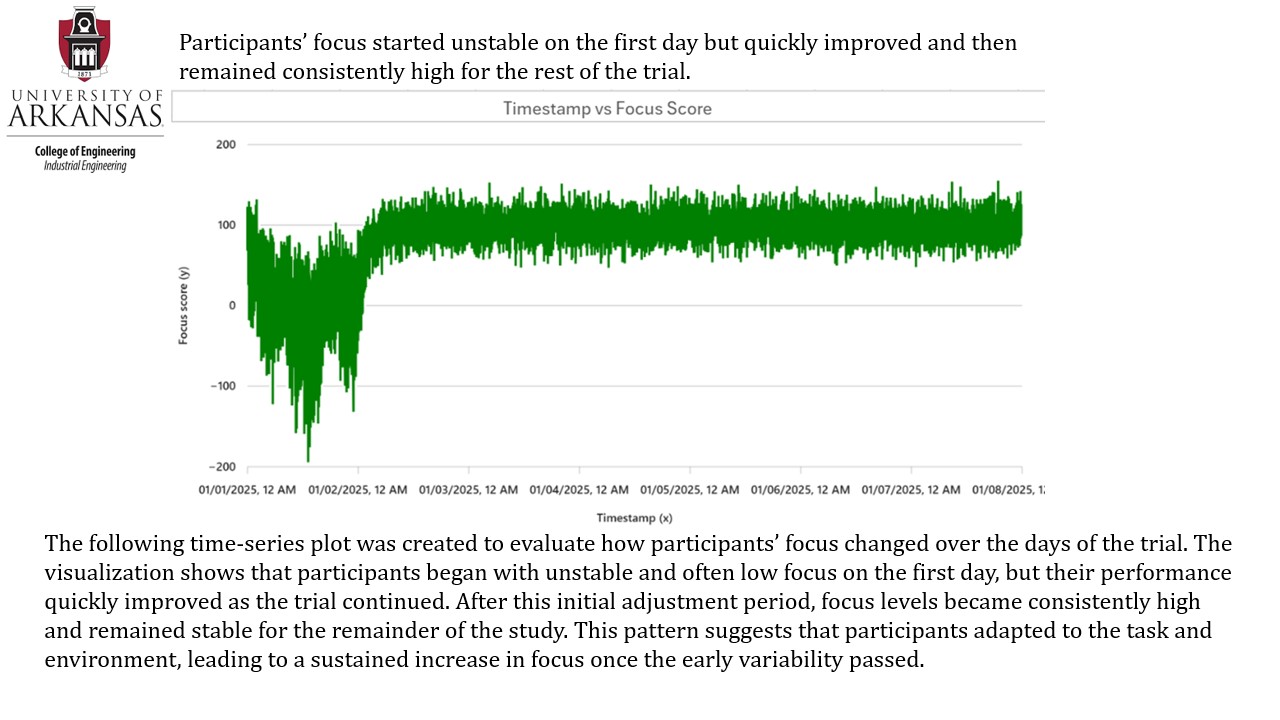
Participants focus started unstable on the first day then quickly stabilized at a consistently high level for the rest of the trial
Question. How did participants focus change over the days of the trial
Why this question is interesting. Focus over time is important for understanding learning adaptation and fatigue. If focus improves and then stabilizes it suggests participants are adapting to the task and environment rather than simply responding randomly on each trial.
What the visualization shows.
The time series display shows a clear adaptation and stabilization pattern. Early in the trial focus scores fluctuate sharply which is typical when participants are newly exposed to a task and have not yet developed consistent performance. Shortly afterward the signal quickly tightens into a stable high performance band where scores stay strong and relatively narrow. This indicates a strong practice effect repeated exposure reduces cognitive load improves efficiency and produces steady high focus. Once adaptation occurs performance remains high and does not drift downward showing no meaningful fatigue related decline over the timeframe of the study.
Last Mealtime versus Task Completion Time
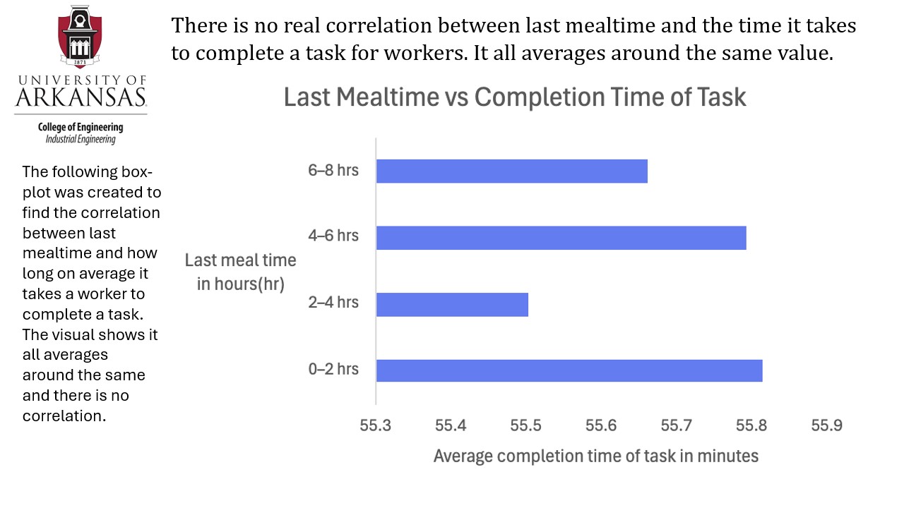
Question. Does the time since participants last ate affect how long it takes them to complete a task
Why this question is interesting. People often talk about being more effective right after eating or alternatively feeling sluggish in certain parts of the day. If time since last meal strongly affected task completion time it would matter for scheduling demanding work.
What the visualization shows.
The scatter plot shows task completion time on the vertical axis and hours since last meal on the horizontal axis. Completion times cluster around a similar duration across the full range of hours since last meal without a clear upward or downward pattern. This suggests that within our data short term differences in time since eating did not substantially influence efficiency on the task. Participants maintained similar performance whether they worked soon after eating or later in the post meal period.